
I spotted this on Twitter the other day and it got me thinking:
.
Biden now leads by 3.86 points nationwide, per @Redistrict popular vote tracker, matching Obama’s 3.86 pt win in 2012. He’ll exceed it soon.
They won by similar amounts in very different ways. Here’s the shift in presidential results between 2012 and 2020— Nate Cohn (@Nate_Cohn) 6:18 AM – 21 November 2020
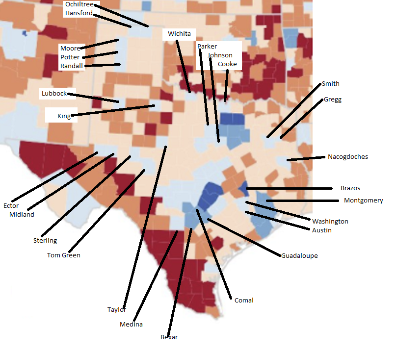
A larger view of the embedded image is here. It was just barely large enough that I was able to compare it to my now-favorite map of Texas counties and figure out what most of those blue places are. (I didn’t work my way through all of them, for various reasons that included my eyesight and my sanity.) I snagged the Texas portion of that image, pasted it into Paint, doubled it in size, and then labeled some of the counties of interest. My handiwork, such as it is, is here. Take a look at that for a minute, then let’s come back and discuss the two main problems with imagery of this kind.
Ready? Problem number one is that you don’t get any sense of the absolute size of the shift, in either direction, from this image. Harris County, which I feel confident you can find even though I have unkindly drawn lines through it to point to other counties of interest, is rendered in medium blue, to show a 10-20 point shift in preference. But that shift represents over 200,000 total votes in favor of Democrats. That didn’t just help to carve into the overall vote lead that Republicans have had in the state, it has enabled Democrats to entirely flip county government, including the judiciary and numerous appellate benches, while also netting a Congressional seat and two State Rep seats. Contrast that to Starr County, which has gotten so much attention and which is among the dark red counties along the southern border, which moved about eight thousand votes towards Republicans. That shift was more significant at the Presidential level, by the way – it’s a bit less than a five thousand vote shift in the Senate and Railroad Commissioner races. Not nothing, and definitely a cause for concern for Democrats, but nowhere close to as substantial as the shift in Harris County. But you would never know that, and the color coding makes it even more misleading.
Problem two is related to problem one but manifests itself in a slightly different way. That problem is that this shift is about the percentage difference between 2012 and 2020. Before I get to the specifics, let me try to explain why this gives a distorted description of the problem with a sports example. Suppose the Texans are playing the Ravens. At the end of the first quarter, the Ravens lead 14-7, which is to say that the Ravens have scored 66.7% of the points in the game. In the second quarter, the Ravens score another touchdown and also add a field goal, while the Texans score a touchdown. That makes the score 24-14 at halftime, and it means that the Ravens scored only 58.9% of the points in the second quarter. Which, if you go by the math used in Nate Cohn’s map, a fifteen-point shift in the Texans’ favor – they went from being down 33 points in the first quarter to being down only eighteen points in the second quarter. Look at them mounting a comeback!
Except of course that on the actual scoreboard, the Ravens have extended their lead from seven points to ten points. The rate by which they are increasing their lead has slowed, but their lead is still growing. The Texans now have a larger deficit to overcome. Perhaps the trends are now in their favor, but the bottom line is that they’re still farther behind than they were before.
All that is why you should look at the light blue shift in Montgomery County, for example, with a cocked eyebrow. It is true, in 2012 Mitt Romney took 79.7% of the vote in Montgomery County to Barack Obama’s 19.0%, for a sixty point lead, while Donald Trump carried Montgomery by a mere 44 points, 71.2 to 27.4. But as we have discussed before, that translated into another 14K net votes for Republicans at the top of the ticket. The Democrats’ deficit continues to grow even as the Republicans’ rate of acceleration has declined. It’s comfort of the coldest kind. The same is very much true for Parker and Johnson counties, and for counties we have not yet discussed, like Comal and Medina and Ector and Midland.
It’s not all gloom and doom. In some places where the deficit increased, the rate of that increase dropped a lot, to the point where you could imagine it turning around in the next election. Lubbock County is an example of that – again, I’ll be going into that in more detail in a later post. In some counties, like Caldwell and Bastrop, there was actually a small gain between 2016 and 2020 after a bigger drop from 2012 to 2016, so while the overall gap is still significant, the direction is what you want. Imagine the Texans winning the second quarter of our game 7-6, so that they now trail 20-14. Denton and Collin counties, which are dark blue in the Cohn map, are the canonical examples here, though Brazos County makes a nice showing as well. We’re still trailing, but you can see how we get to the lead from here.
I don’t want you to look too skeptically at every blue spot that isn’t immediately identifiable as a Dem beacon. Dems really don’t need to win too many counties to carry Texas some fine day, because of their massive advantage in the biggest counties. We don’t need Montgomery County to turn blue to win the state. We don’t even need it to be on a path to turning blue. We just need the gap between Republicans and Democrats to quit growing, and maybe shrink a little. One way we were able to turn Harris County blue was that we could rally Democrats in heavily Republican areas because they knew their votes were important to flipping (and now maintaining) the county as a Democratic bastion. In Montgomery, that task is abstracted out one level further – there aren’t any local candidates who are likely to win, at a district or county level, so the motivation has to come from your votes mattering at the state level. It’s a heavier lift, since those statewide candidates won’t be as well known locally and will likely not spend much if any time there campaigning, and I have tons of respect for the effort made in spite of those conditions. We need that in more places around the state.
Again, we have discussed some of this before, and will discuss it again soon. I’m now thinking I need to adapt my Presidential-level vote series on “surrounding counties” to the Senate and other statewide races. That ought to keep me busy for the next few weeks.
Before we go, one more example that highlights both of the issues I have identified in this post. Take a look at King County, east of Lubbock and north of Abilene (Taylor County). Who would have expected a blue shift in a place like that? Well, here are the numbers for King County in 2012 and 2020:
Romney  Obama  Romney%  Obama%  Margin
======================================
   139      5    95.9%    3.5%    92.4

 Trump  Biden   Trump%  Biden%  Margin
======================================
   151      8    95.0%    5.0%    90.0
There was one vote in 2012 for Libertarian Gary Johnson, and no third-party or write-in votes in 2020. This is what a “blue shift” in King County looks like. I’m sure I’m as impressed as you are.